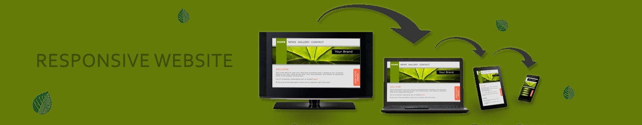
Responsive websites are websites that can be viewed on any device. Page widths, colors, links, texts, graphics, and videos all adjust automatically to fit the size and shape. Of whatever screen it’s viewed on — from a large HD monitor to a small phone screen. With responsive website, you can ensure that your website features. And the tools and content you need to grow your organization.
With responsive web design services, you eliminate the need for multiple codes for separate web pages and sites. Accordingly for different computers, smartphones and tablets. On large monitors, there’s no loss of resolution. So the images and graphics are as crisp and clear as if viewed on a mobile device. Your brand stays intact across all devices. You can ensure all the web pages displays and operates as intended on every screen, every time.
Impress your visitors with responsive web design services from V Think Solution. In addition, Better graphics, more accessibility and a mobile-first approach. It means that your visitors are more engaged and more likely to use your services over your competitors. Moreover the latest web design strategies and technologies to transformation of your website. So, transform into an effective sales tool for your business.